Skip to content

PROJECT OVERVIEW

  • Competitor Analysis
  • Branding and Identity
  • Logo Creation

Nanohmics is a Texas-based R&D technology corporation launching a subsidiary company in the electrical engineering industry, AmperEdge. The new venture takes an innovative approach to an existing technology, updating its application and hardware for 22nd-century use. This brand will be turning science fiction into science fact, and Fahrenheit is thrilled to be supporting such a forward-thinking company.

The passionate owners realized their need for branding assistance when they couldn’t get their vision for a new company to coalesce into a name that matched the design they conceived and kept returning to. As a technically and creatively skilled agency, we knew we could bring this complex brand to life. 

RESEARCH & PLANNING

We took the time to meet with our client to fully understand their vision for the then-nameless AmperEdge, the brand’s unique selling points, and its key differentiating features both from competitors and from the parent brand.  Our branding specialists scoped out several key components vital to this project: a name that suggested a relationship between electric engineering, temperature, and Edge, the availability of domains for their suggestions, a logo design, and a brand book.

OUR PROCESS

When ideating and creating any logo, we place significant emphasis on melding aspects of the brand identity into a sleek, modern, and adaptable design. In this case, the client came to us with a vision for a design motif they couldn’t quite capture themselves or even fully articulate. Nor did they have a fully-fledged name for the company. They worked closely with our team to identify symbolism and nomenclature, eliminating options that elicited negative memories or felt too similar to competitors 
in their space.

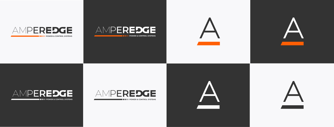
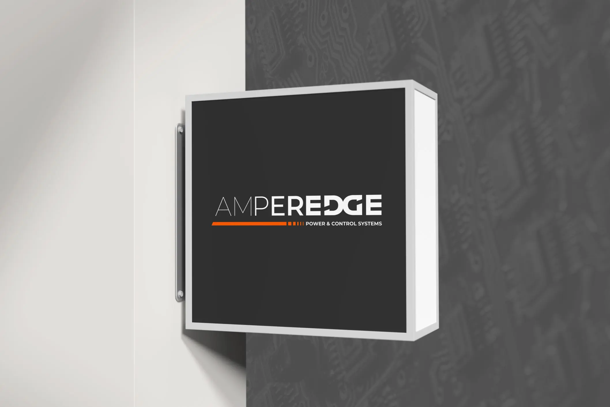
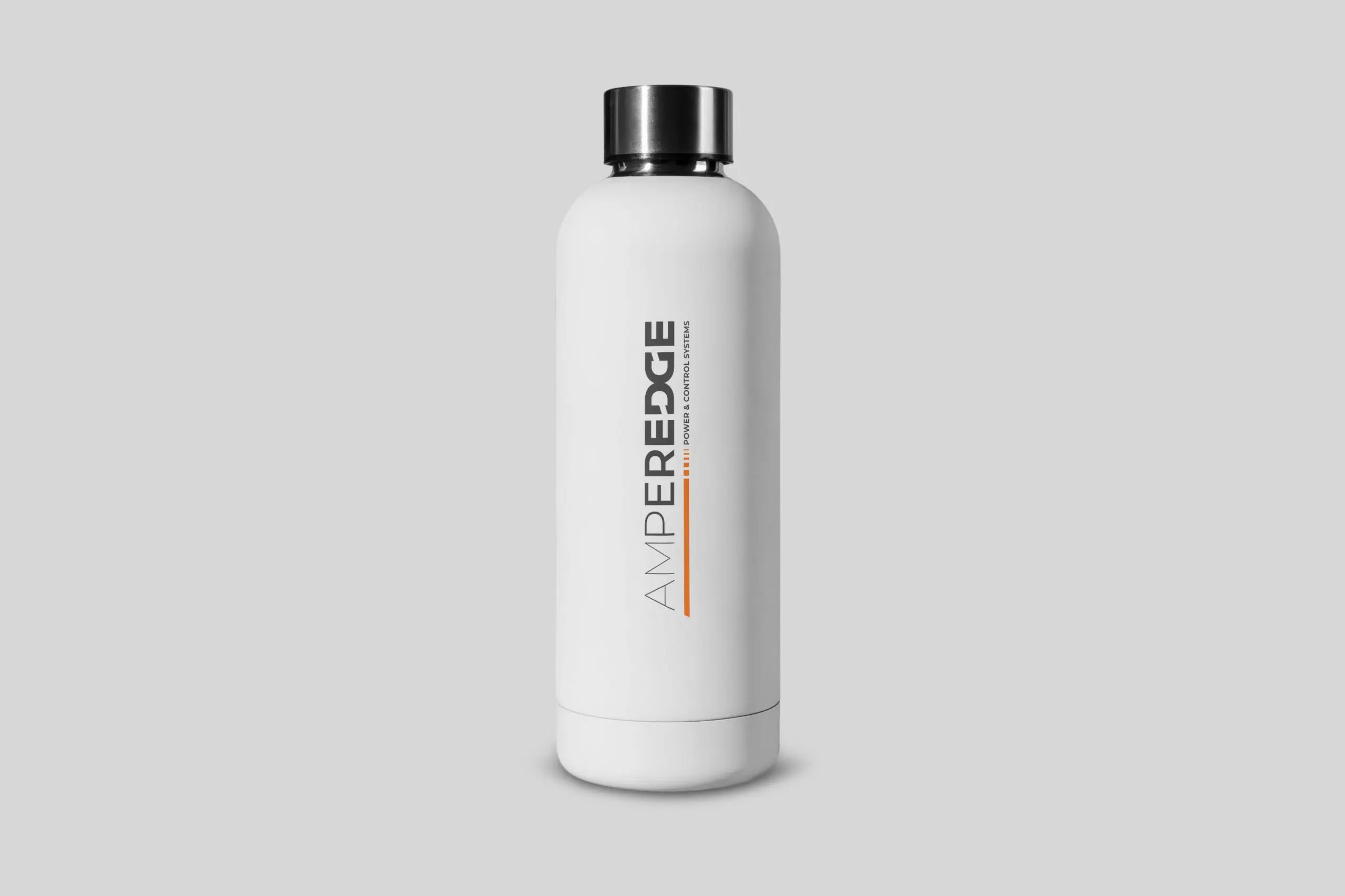
After deciding upon an available name, we iterated a unique wordmark logo by combining the words  "Amper," the unit of electric current, and "Edge," which signifies the company's commitment to staying at the forefront of the electrical engineering industry. We came up with a modern AmperEdge logo by combining their technical expertise with forward thought and competitive edge.

The logo design incorporates lines and geometric shapes to visually demonstrate the company's ability to navigate complex systems. Its wordmark illustrates the company's uniqueness and emulates the precision and connectivity that's needed for electrical engineering innovation.

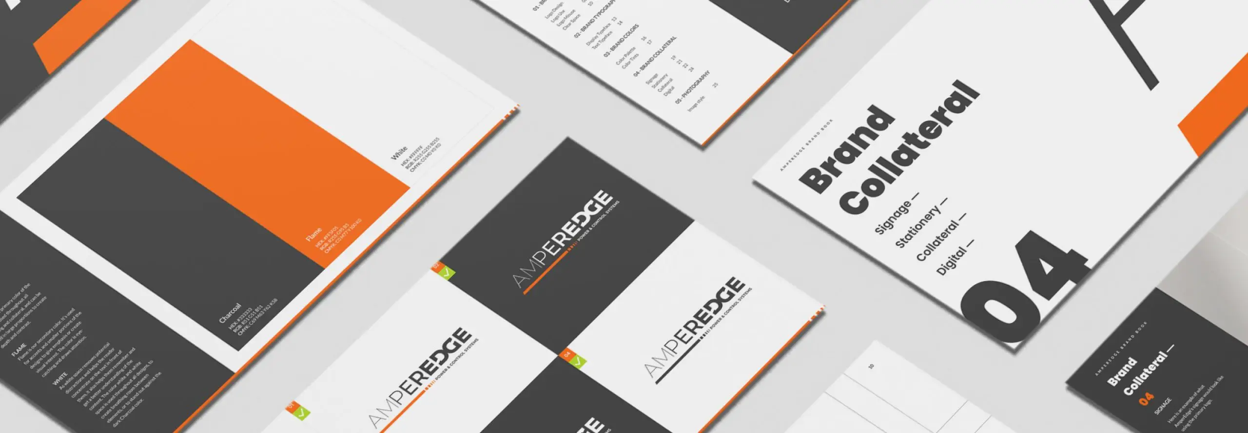
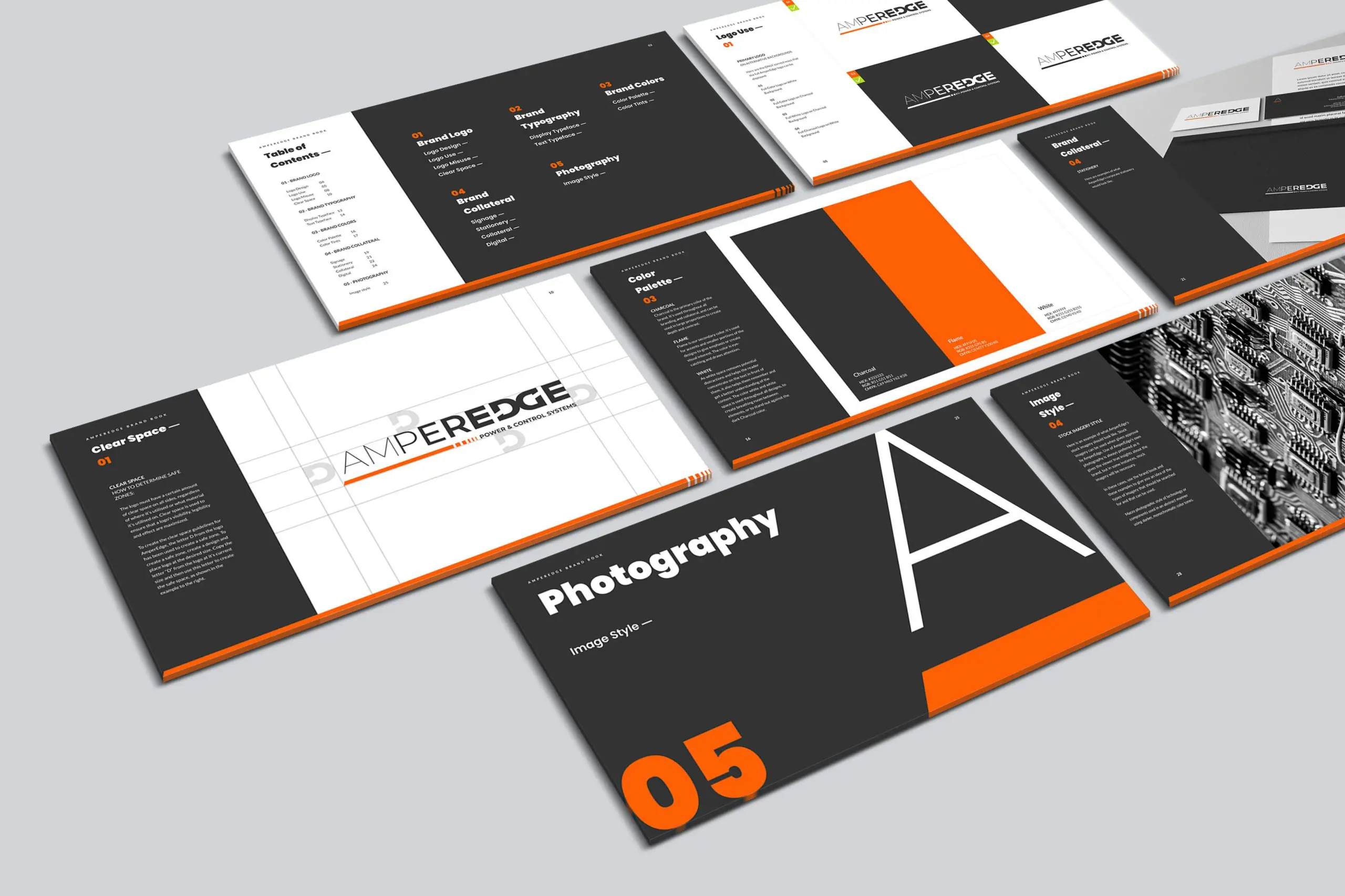
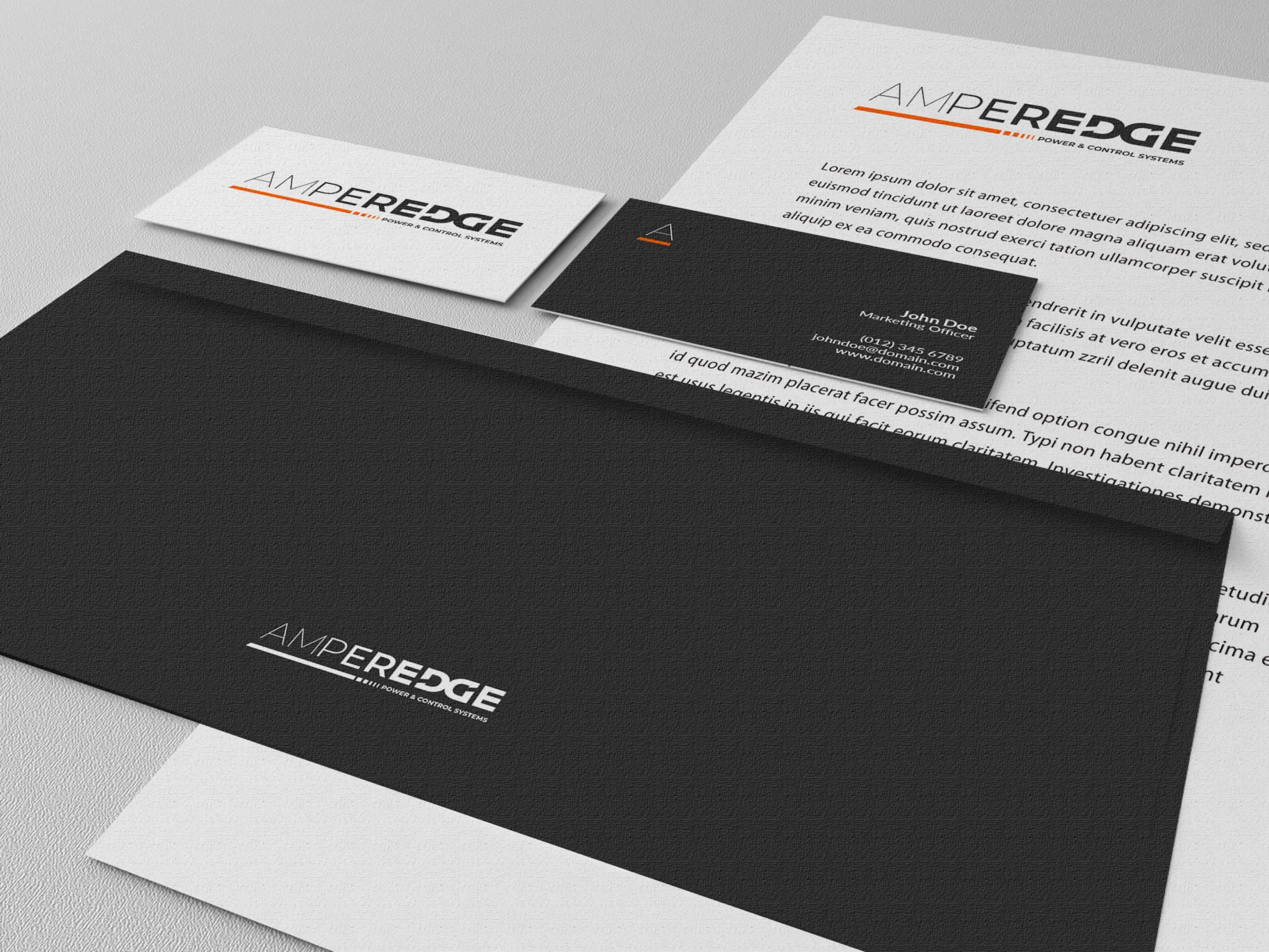
We presented our client with our logo design and brand colors, encouraging sufficient rounds of feedback. Once the logo and colors were approved, we then went on to develop a comprehensive brand guide to establish a consistent visual language.. This brand book is to be utilized in all future collateral and digital marketing communications. It includes logo usage "do's" and "don'ts," color palettes and codes, typography styles, and photography usage examples. 

The Outcome

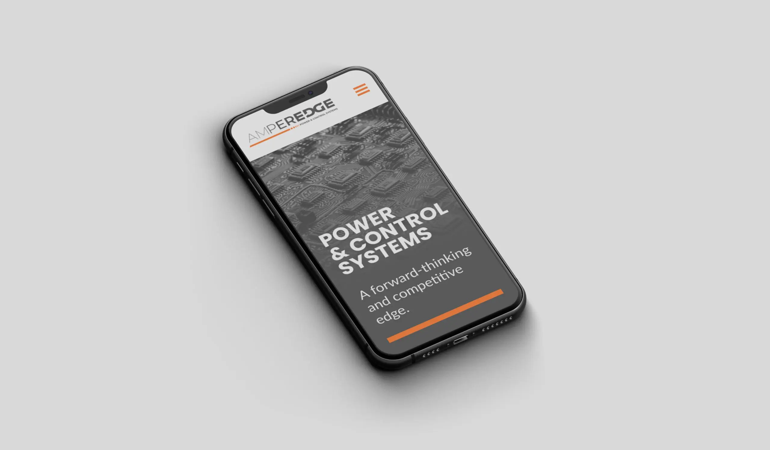
Building a brand from scratch is no easy feat, but building one when a client has an ethereal image that you must materialize is a special challenge. We are proud to have brought forth a unique logo for a unique brand entering a niche industry. AmperEdge now has multiple iterations of its logo that emulate the novel company’s core mission and capabilities. 

The brand book we created gives AmperEdge the ability to ensure future brand collateral is consistent with the company's design language and identity. With these branding materials in their wheelhouse, AmperEdge will be able to establish themselves as an expert within the electrical engineering industry.

As a full-service digital agency, we employ the best and brightest UX/UI designers and branding specialists. Have questions about our brand development process and logo creation process? We have answers. Schedule a call for a complimentary consultation.

COME WORK WITH US

Like what you see?
Contact us to discuss your project. We’re ready to help.

Contact Us

This field is for validation purposes and should be left unchanged.