Skip to content

PROJECT OVERVIEW

  • WordPress
  • Website Design
  • Development

When Lonestar Distributors, a Texas-based warehouse management and transportation organization identified a need for a website refresh, Fahrenheit was eager to take on the project. Their previous website wasn’t performing to their standards and was lacking pertinent information that would highlight their unique selling points in a way prospective partners would understand.

Challenges

  • Low technical performance
  • Outdated site elements
  • Bland imagery
  • Lack of branding

Goals

  • Improve branding
  • Incorporate engaging imagery
  • Introduce engaging and interactive elements
  • Add careers page functionality
  • Improve speed and performance

RESEARCH & PLANNING

Our team of developers, designers, and content strategists conducted an extensive review of Lonestar Distribution’s existing digital presence. We discovered numerous pain points and inefficiencies and brought them to the client’s attention. We then curated website solutions that would extricate these bottlenecks while highlighting Lonestar Distribution’s core competencies.

SOLUTIONS

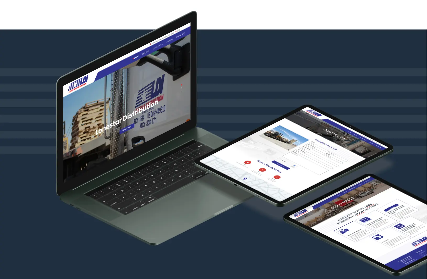
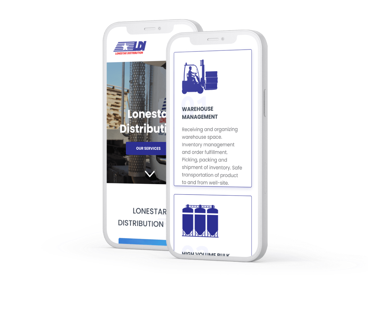
The first step? Restructuring the site to make navigation logical and seamless. Our UX designers carefully crafted wireframes for desktop and mobile iterations of the site. After showcasing and ensuring our visions were aligned with Lonestar, we moved on to optimize UI design. After ensuring the interface was navigable and elements were in their proper placement, we went through the QA process, carefully testing each element on multiple screens and devices.

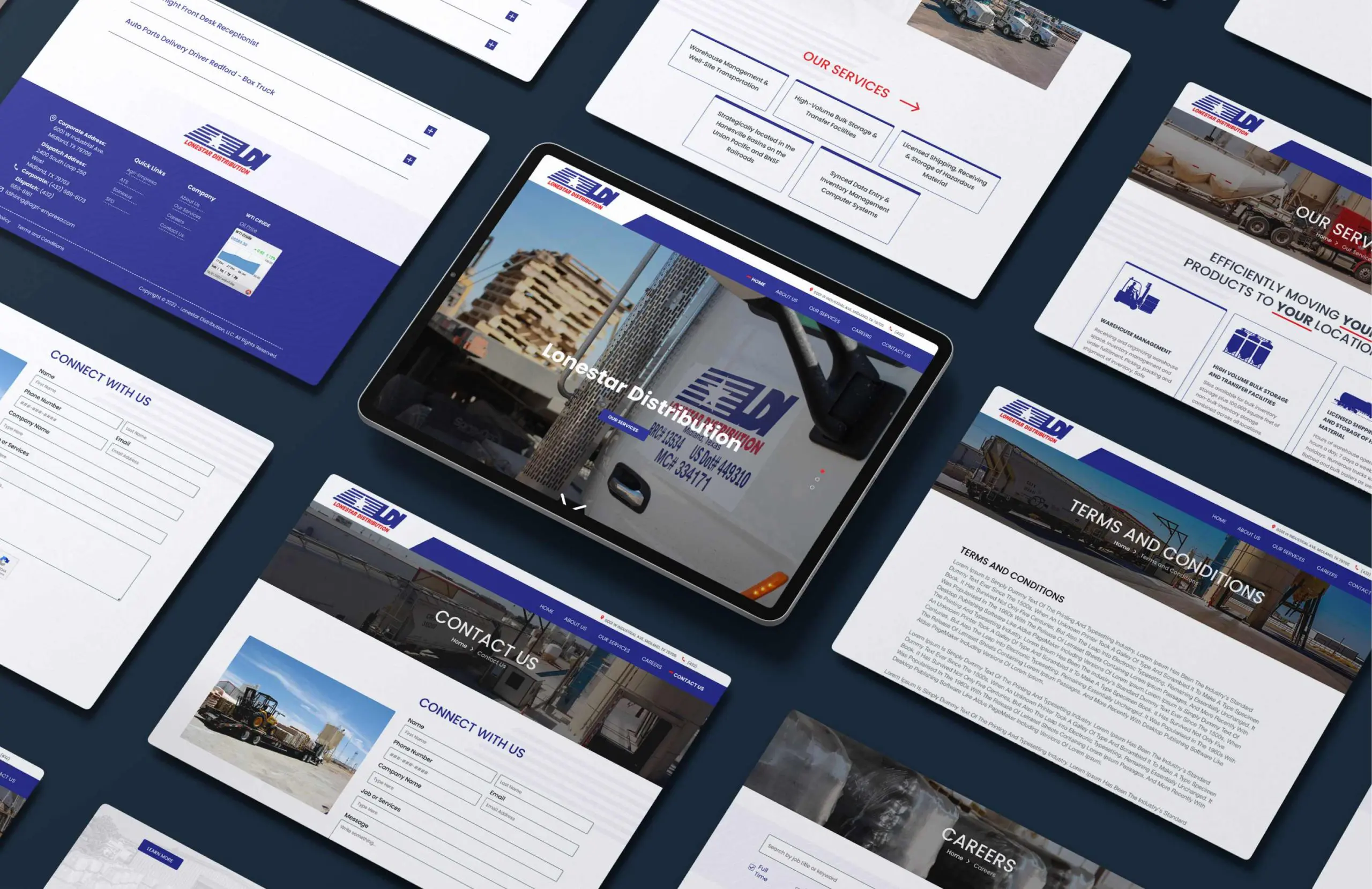
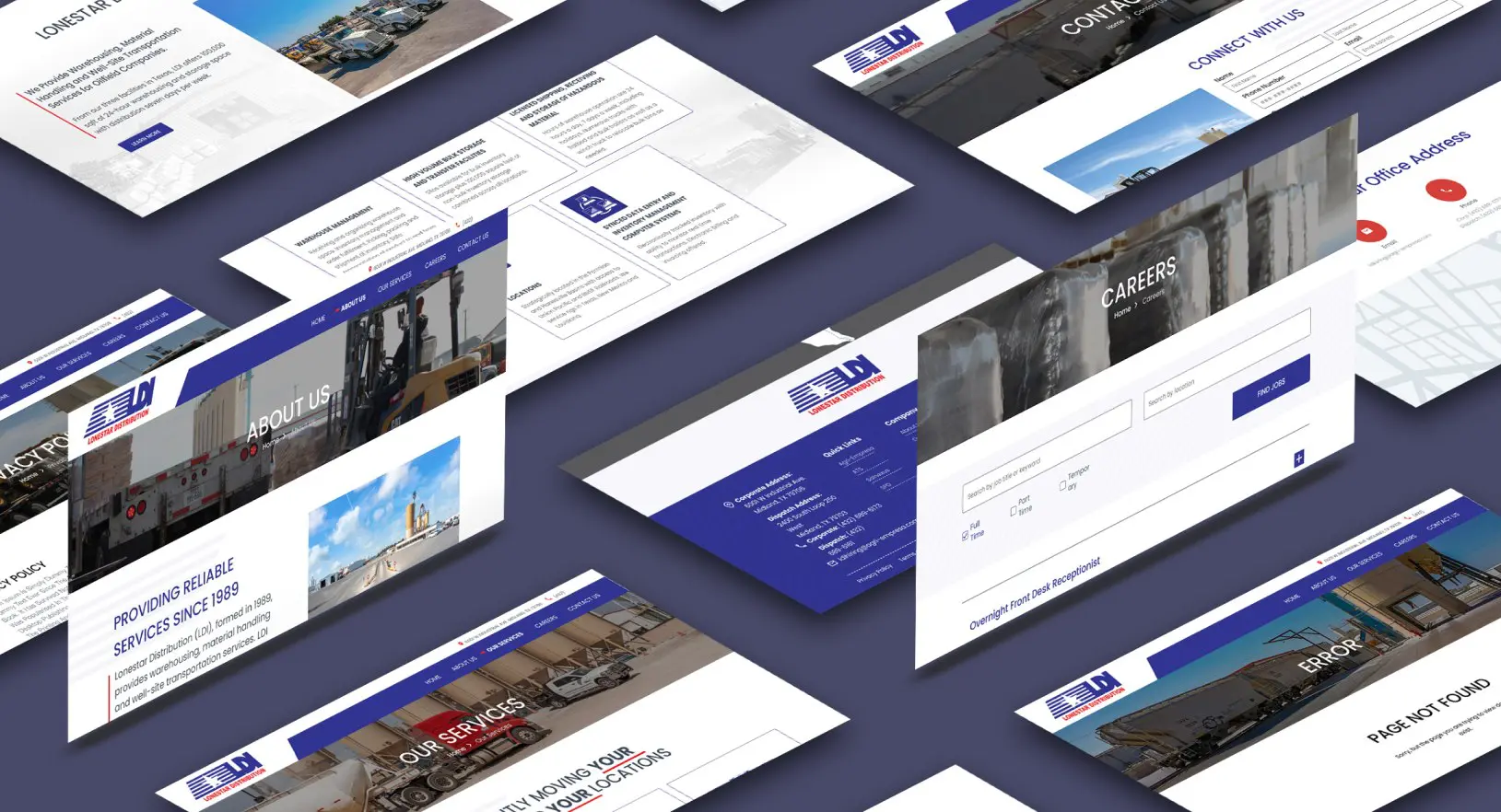
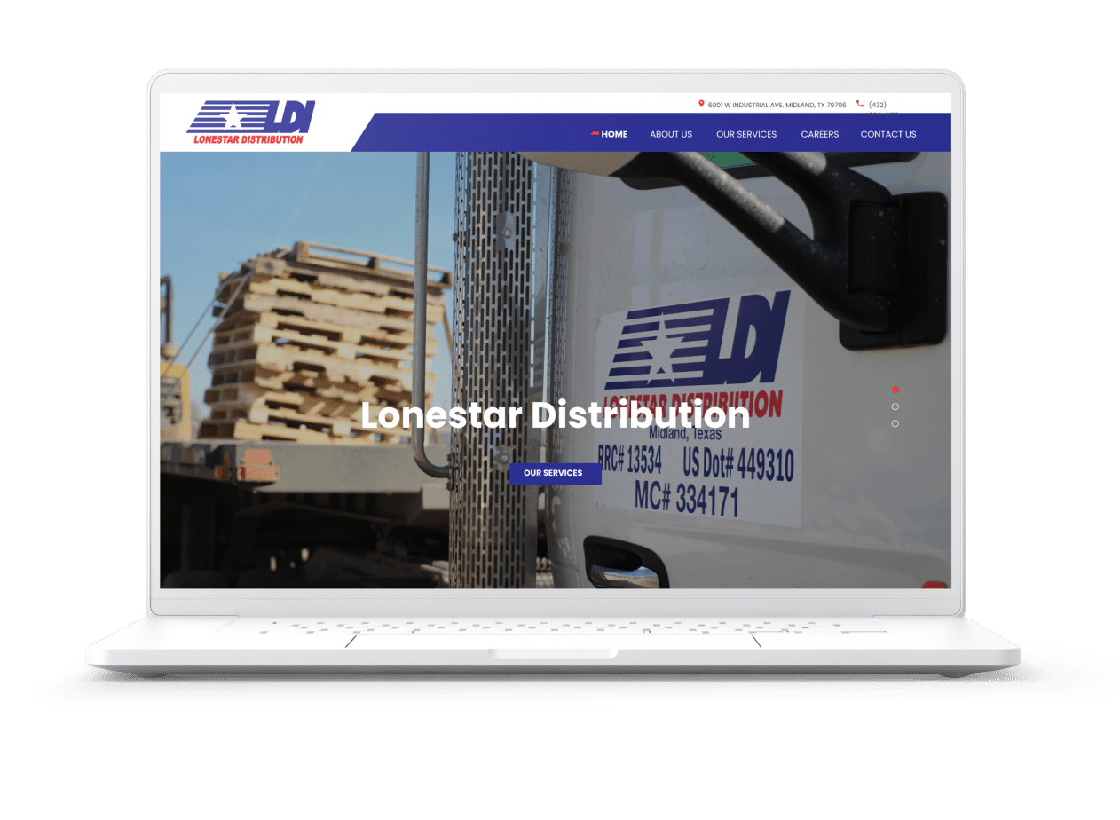
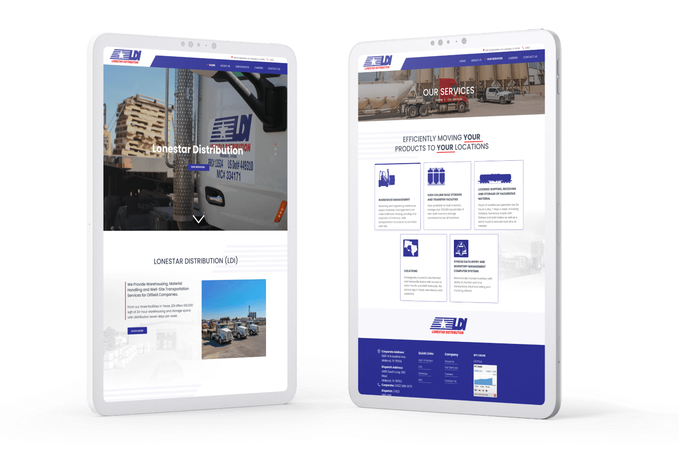
We selected WordPress as our web development medium. WordPress would allow for client autonomy when updating content and offerings. We revamped the website structure and design and introduced a new header and footer with deliberate linking, including access to sister websites, contact information, and relevant service pages. We also introduced a new careers page functionality while maintaining website responsiveness. Our designers then sourced and placed visually engaging imagery to further delight users and cement the brand as experts in their industry.

Some of the distinguishing characteristics of this site that further highlight our expertise are the iconography that made otherwise bland content more exciting, how we transformed plain bullet points into clickable/hoverable content that engaged the viewer while highlighting pertinent material, and the refinement of the design to include only those elements that the company wanted, such as limiting the ways they could be contacted through the site.

The outcome


We are proud to have delivered Lonestar Distribution with a technically flawless website that allows visitors to view them as not only a reference but an expert in their industry. We are sure that this web development project will provide them with a beautiful and reliable digital presence for years to come.

Want to learn more about how Fahrenheit can provide tailored solutions for your next digital project? Reach out to our team and schedule a consultation. We look forward to helping you grow your business.

COME WORK WITH US

Like what you see?
Contact us to discuss your project. We’re ready to help.

Contact Us

This field is for validation purposes and should be left unchanged.