Skip to content

PROJECT OVERVIEW

  • WordPress
  • Website Re-Design
  • Development

QuikTrip is a recognizable name for highway travelers across 14 states. Their fuel stations and convenience stores have redefined the customer service and shopping experience for an entire industry. On the information superhighway that is the internet, they had fallen behind; their digital presence no longer matching the quality of their in-store experience.

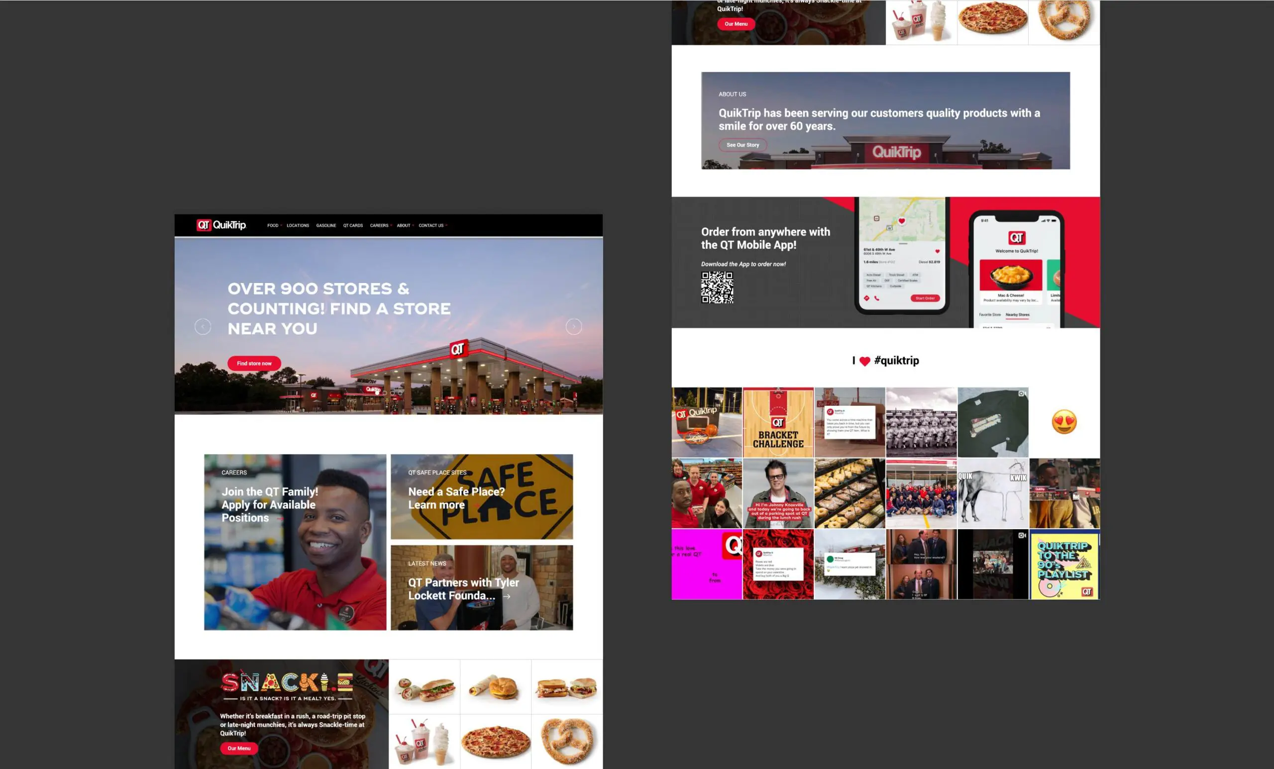
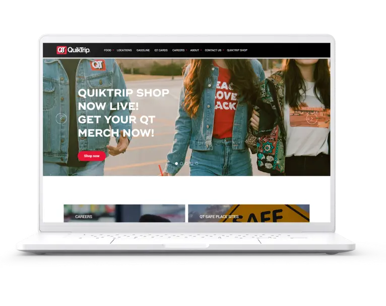
Fahrenheit was hired to modernize their website while enabling their staff to take the wheel and drive daily changes. They sought a user-friendly content management system and a sleek, brand-driven design that would allow them to frequently update their announcements and offerings.

Challenges

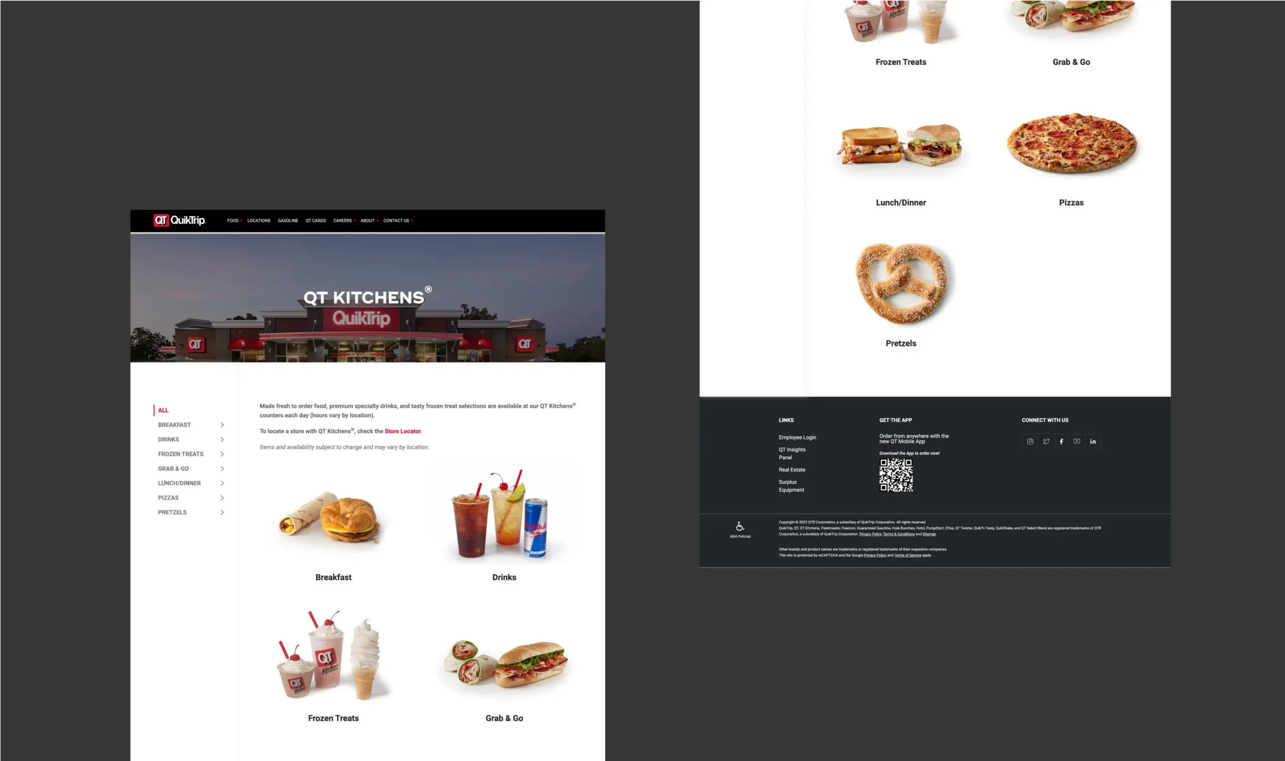
  • WCAG compliance – Having an Accessibility-friendly site showcasing an updated brand look and feel, vivid imagery, and ability to order from QT Kitchens through the site was a must have.
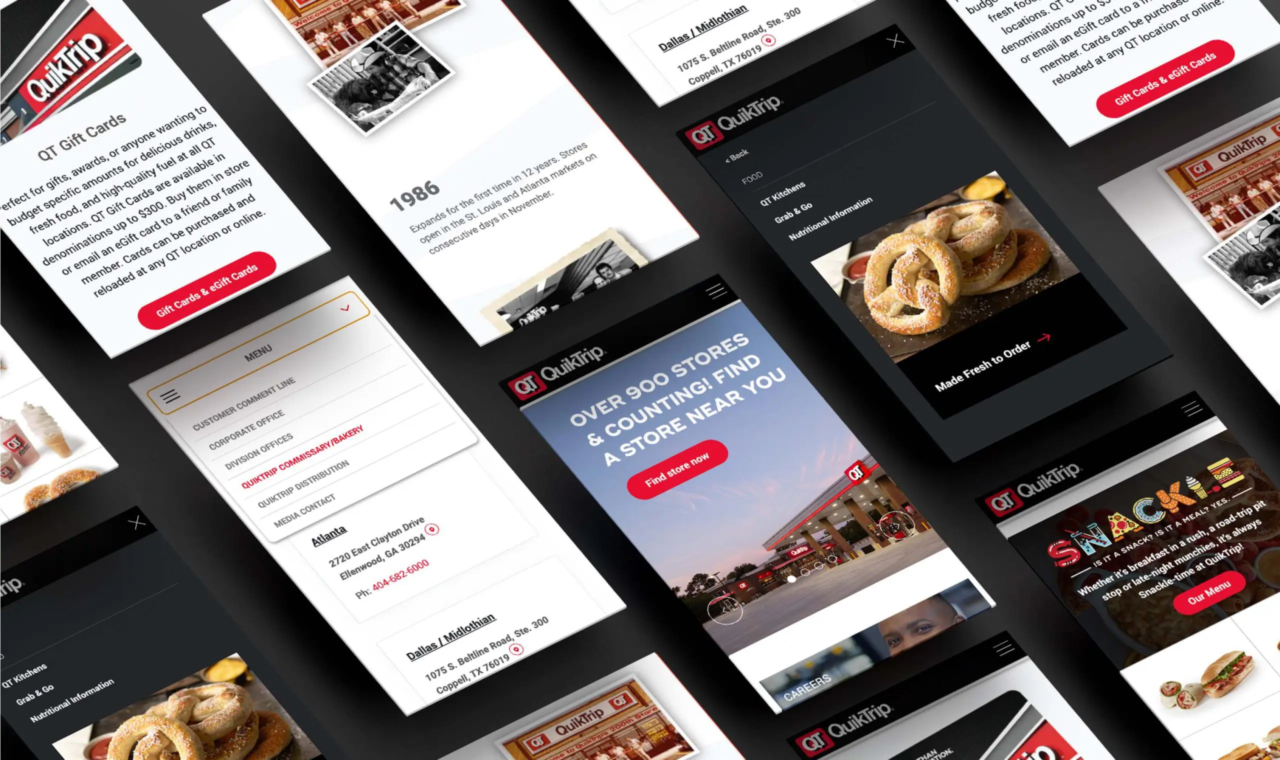
  • Mobile-first design – Because most people seeking information on QT are on the move, in a car or bus, they needed their site to perform well on every device.
  • Back-end management – QT wanted the ability to manage their own site. They were looking for advice on what content management system to use that could incorporate videos, product pages, nutritional items, and food ordering.

Goals

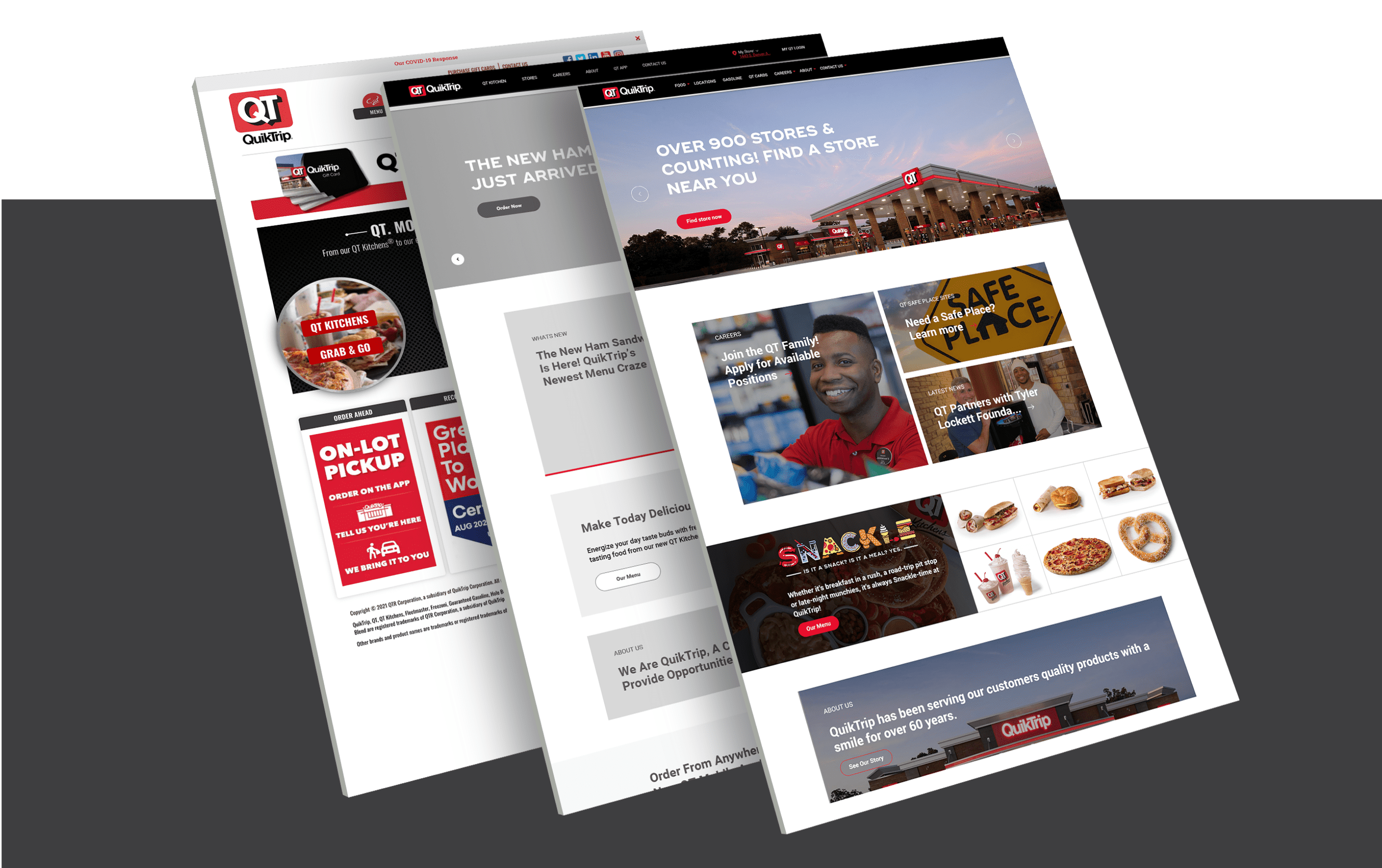
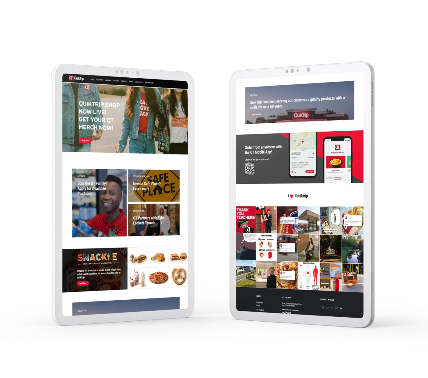
  • Redesign and deliver – QT originally identified a need for a redesigned site that allowed them to showcase more imagery, messages, content, and features. Going from five, compartmentalized sections to eight, integrated and vibrant sections, Fahrenheit would not only design and build their website but return control over it with a custom-styled Elementor plug-in, so that it would never again be stale.

RESEARCH & PLANNING

The previous QT site was not exciting and the theme lacked cohesion. It was limited to a few sections and relied heavily on navigating to subpages from the navigation bar, which people were not doing.

Being familiar with most Content Management Systems (CMS) Fahrenheit knew their reputations for user-friendly applications. We wanted to find a solution that was intuitive, hard to break, and would allow for integrating video and high-quality images.

Designing SOLUTIONS

Fahrenheit’s goal was to represent a majority of their content directly from the homepage so that destinations were immediately obvious, especially considering a mobile-first audience.

WordPress was our suggestion along with Elementor, a drag and drop editor. Fahrenheit would custom-code their style sheet so that everything they produced would be on brand and look stellar.

Scroll Here
Portfolio Page Portfolio Page

The outcome

Take a moment to visit QuikTrip.com from both your mobile device and your desktop. While QT has had full control of their content since launch, the site still remains stable and beautiful on both views.

Fahrenheit helped QT choose the right CMS for the level of engagement they wanted to have with their site. The layout and design continues to remain relevant and meet their needs.

OUR METHOD FOR ACHIEVING THESE RESULTS

Through our knowledge of content management systems and fresh design, we were able to present QT with a detailed tutorial and support for manipulating content on their site while keeping the user experience as a priority.

Our Design team worked with QT at each stage from wireframing the new website to creating a new feel for the site.

With QT, our work continues as we help them further understand their audience’s behavior and offer opportunities for marketing growth.

COME WORK WITH US

Like what you see?
Contact us to discuss your project. We’re ready to help.

Contact Us

This field is for validation purposes and should be left unchanged.