Our designers chose Adobe Illustrator & Figma for our logo development mediums. When brainstorming and designing the initial logo, our designers saw the value in blending the stark nature of the product’s innovative applied science with the warmth associated with the electrical engineering industry.
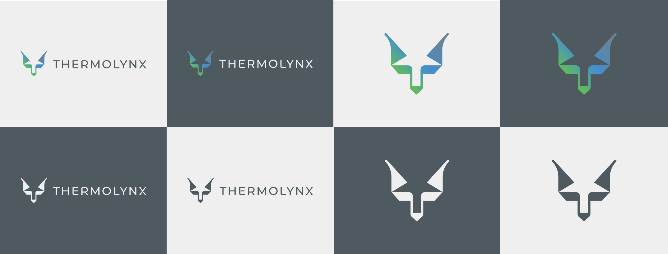
The Thermolynx logo combines the concepts of "thermo" and "lynx," as well as a play on words with "Lynx" and"Links," introducing an element of playfulness to the logo. Using a immediately identifiable visage of the lynx head, they next iterated to find the particular angles, weight, colors, perspective, and the perfect ratio of abstract to realism for a memorable and identifiable brand mark.
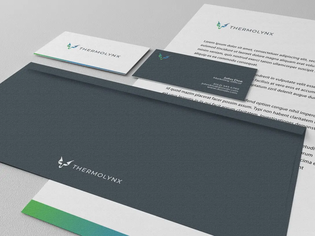
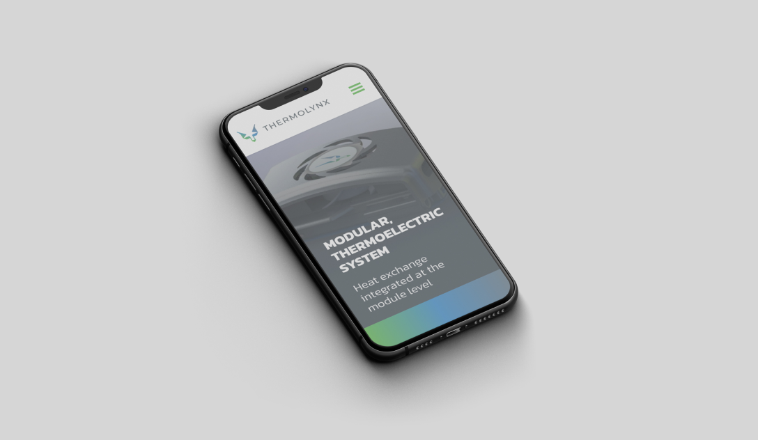
Designed to represent the brand's unique identity and capture its particular essence, the logo aims to create a solid visual representation of the lynx in colors associated with heat, energy, and temperature transfer. We incorporated gradients and fading effects to further enhance the representation of temperature variation. With several iterations of color temperature and color scale, we found the right mix to please the client.
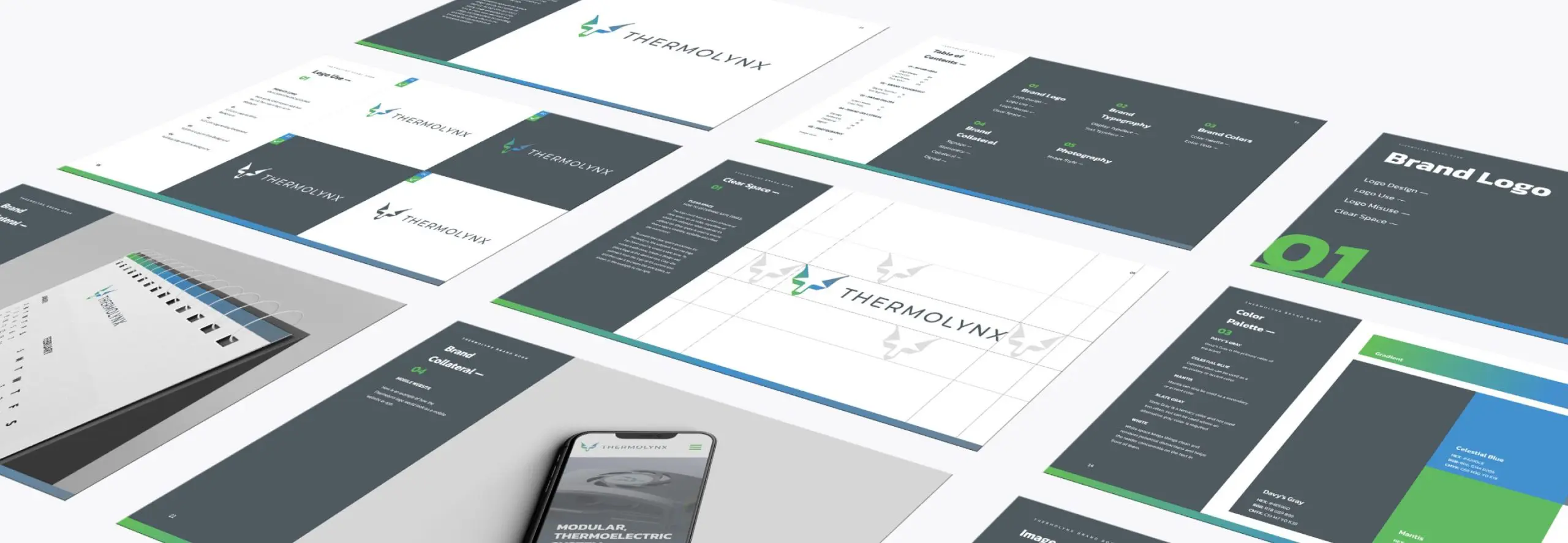
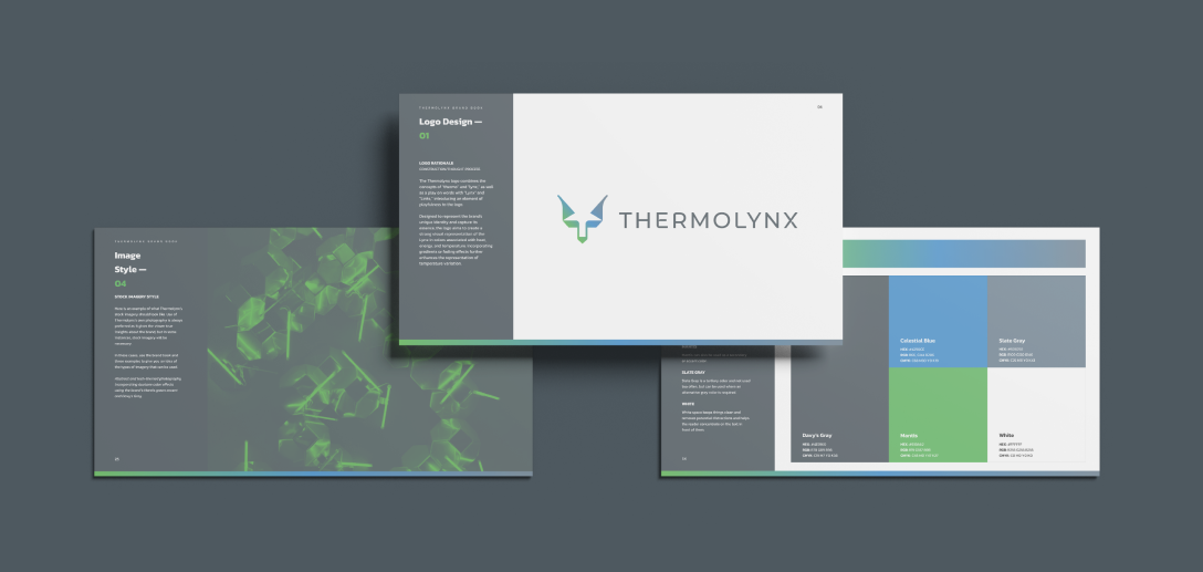
We then developed a brand book. This brand book was created to outline the specifics of using the logo in all branding materials and collateral. It also provided Nanohmics with specific guidelines on typography usage, color variants, and formatting, as well as product photography dos and don'ts. For companies poised for growth, holding onto brand identity and control is crucial.
New marketers always want to innovate, and industry partners typically don’t think to protect the logo, compressing or resizing to fit their needs. Only with a shareable brand guideline document can companies insist that their logo be kept sacrosanct.


